Role
Lead UX Researcher
& UI Designer
 Ethan Haque / Design
Making the road to recovery feel a little less uncertain.
A mobile rehabilitation concept that brings exercise guidance, everyday progress, and therapist conversations into one calmer experience.
Mendora started with a simple question: what gets in the way of following a rehabilitation plan between appointments?
I spoke with two student-athletes and one physical therapist over Zoom. Rather than testing a finished product, these early conversations helped narrow the problem to three opportunities: clearer instructions, motivation, and direct support.
Small, exploratory sample. The numerical ratings describe these participants only.
Average across the three participants
Average across the two athletes
Average across the surveyed group
Make daily rehabilitation understandable, show meaningful progress, and keep the therapist within reach.
These artifacts come from the December 2024–January 2025 source deck, rather than a new research study.
Two student-athletes and one physical therapist
Visual aids helpfulness (athletes) and usefulness of progress tracking (PT)
Three people; no population-wide conclusions
The source deck compared MyFitnessPal, Physitrack, and Strava on the capabilities Mendora aimed to bring together. These are my original project assessments, not current product evaluations.
| FEATURE / CAPABILITY | MyFitnessPal | Physitrack | Strava |
|---|---|---|---|
| 01 Personalized rehab plan | Not marked | Included | Not marked |
| 02 Progress tracking | Included | Included | Included |
| 03 Intuitive interface | Not marked | Not marked | Included |
| 04 In-app messaging | Not marked | Included | Not marked |
| 05 Multiple connections | Not marked | Included | Not marked |
Progress tracking was the only criterion marked for all three products. No app was marked as meeting all five criteria in this original audit.
“Intuitive interface” is a subjective judgment from the project deck. Feature availability and labels reflect the 2024 student project, not an independently verified market analysis.
These are the project’s illustrative personas; they should not be confused with additional research participants.
Soccer student-athlete, navigating ACL rehab and wanting confidence that exercises are performed correctly.
Need: clearer guided routinesPhysical therapist managing several athletes, frustrated by fragmented email, phone, and other conversations.
Need: communication in one placeFour overlapping phases, from discovery through usability iteration.
Rather than add features for their own sake, I translated the initial research signals into three focused experiences. Each decision points toward an original screen.
Instruction clarity averaged 4/10; athletes rated visual aids 5.5/10 for helpfulness.
Guide each activity with an exercise list and video demonstration.
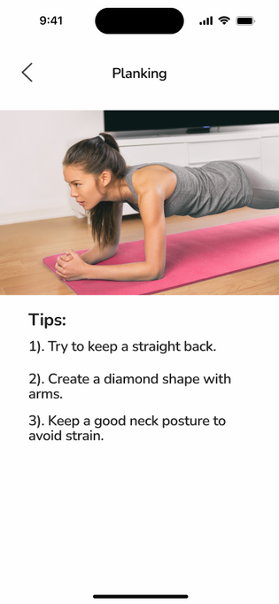 EXERCISE VIEW
The athletes’ reported motivation averaged 4/10; progress tracking was rated 6/10 by the therapist.
Give athletes a readable daily plan and an at-a-glance view of activity.
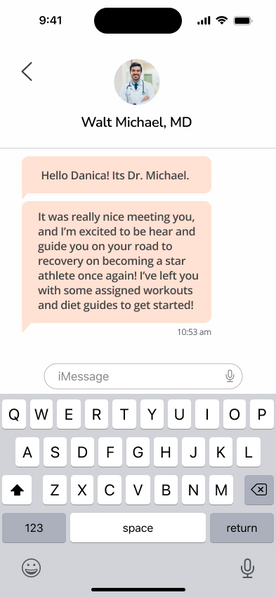
DAILY DASHBOARDImportance of direct communication averaged 6/10 across the three participants.
Connect the daily experience to in-app therapist conversations.
THERAPIST CHATThese three design responses align with the original deck’s proposed solution: personalized rehab plans, progress milestones, and therapist messaging. The connections shown here are a retrospective explanation of the design rationale, not proof that the features improved recovery.
Dashboard, exercise program, exercise guidance, and therapist conversation journeys
Clinical outcomes, long-term adoption, measured motivation improvement, or population-level validation
THE PRODUCT EXPERIENCE
The research called for clearer guidance, visible progress and easier communication. I explored how two everyday journeys could feel connected rather than fragmented.
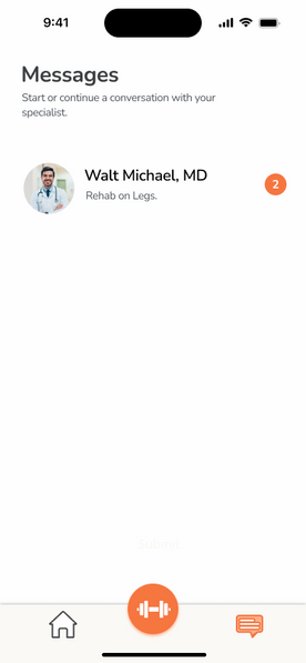
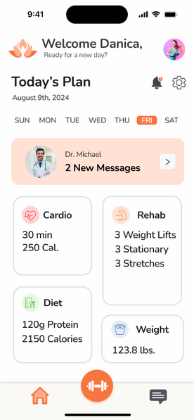
A therapist message is visible alongside the daily plan, then just a few taps away.
FOLLOW THE JOURNEY
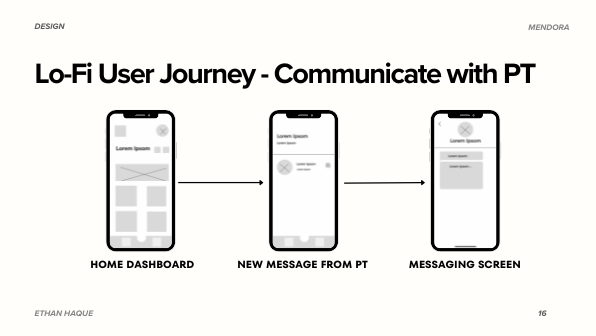
The daily dashboard puts the new message beside today’s rehabilitation information.
A small number of visible destinations helps people move from an update to the relevant task.
Messaging and exercise guidance stay close to the activities athletes are trying to complete.
Three stages of the original process, reframed for easier reading. Each step links to its original source artifact.
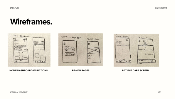
Early sketches considered dashboard, exercise and patient-care screen arrangements.
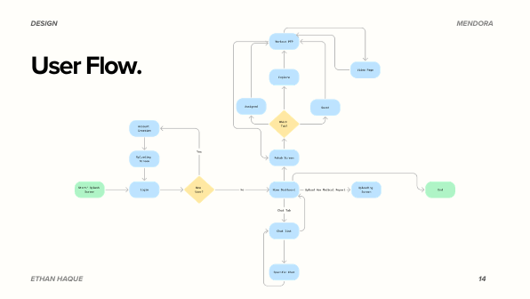
View original sketchesThe original navigation diagram connected onboarding, the daily plan and supporting destinations.
View original user flowThe low-fidelity journey explored moving from a dashboard update into therapist messaging.
View original low-fi flowMini diagrams are retrospective visual summaries, not additional original wireframes. The links open the actual project artifacts.
Six screens show the two featured journeys. Two more document the signup and patient-report step used in the later iteration.
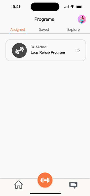
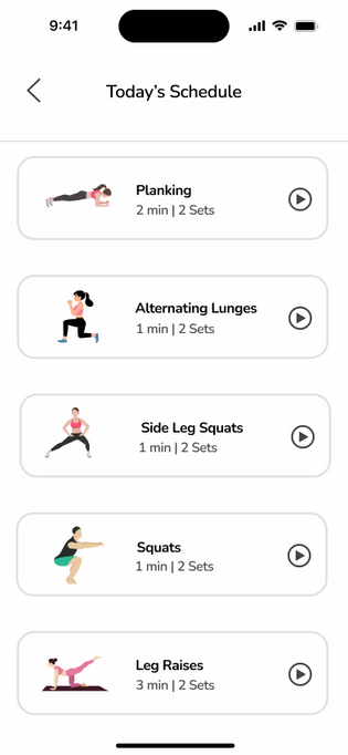
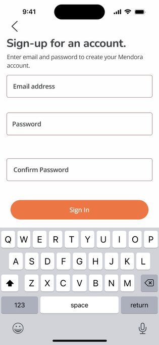
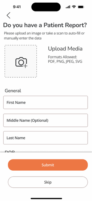
The device animations and case-study compositions were made for this portfolio presentation. The interface screens themselves are from the original project.
Three participants completed core navigation tasks. Their feedback raised a new question: where should an athlete add an existing patient report?
EXPLORE THE TEST / SELECT A TASK
Average recorded task times in seconds. Different tasks are not directly comparable.
Participants questioned how to input new patient information while accessing their workout.
After the initial sign-up screen, I introduced a dedicated report-upload step. The original deck also notes that users could reach it after creating an account.
This is an untested iteration responding to early feedback—not measured proof of improved usability or recovery outcomes.
Recorded task times and observations, redesigned for readability. No follow-up testing of the new upload step was documented.
UI worked and was clear as expected
Participants asked how to input new data
Icons helped guide users
Only three participants. No comparison baseline, confidence interval or clinical outcome measure was reported.
The deck mentions adjustments to contrast, buttons and icons for different technical comfort levels; no formal accessibility audit is documented.
LESSONS FROM THE FIRST ROUND
The numbers described how people navigated. Their questions revealed what the experience still needed.
The messaging task was described as working and clear as expected.
Questions about entering patient information pointed beyond the workout screen toward onboarding.
The original notes called out icons as helpful when participants checked daily stats.
Beyond expanding testing with more physical therapists, I'd explore gentle wearable cues that surface the day's plan and completed exercises without asking someone to keep checking their phone.